

Visual, logo and title typography for a web comic of mine: DiDODRA!.
The typography is 100% custom made and hand drawn. It is meant to express a whimsical look that reflects the content of the comic, while remaining simple and regular to accompany the minimalistic style of the comics drawings. DiDODRA! is a playground of ideas, which present themselves as wordplay, situational humour, absurd jokes. Those ideas are incorporated in the logo with shape play, repetition of shapes and patterns, as well as creatively molding the lettering to create a unified and simple image.

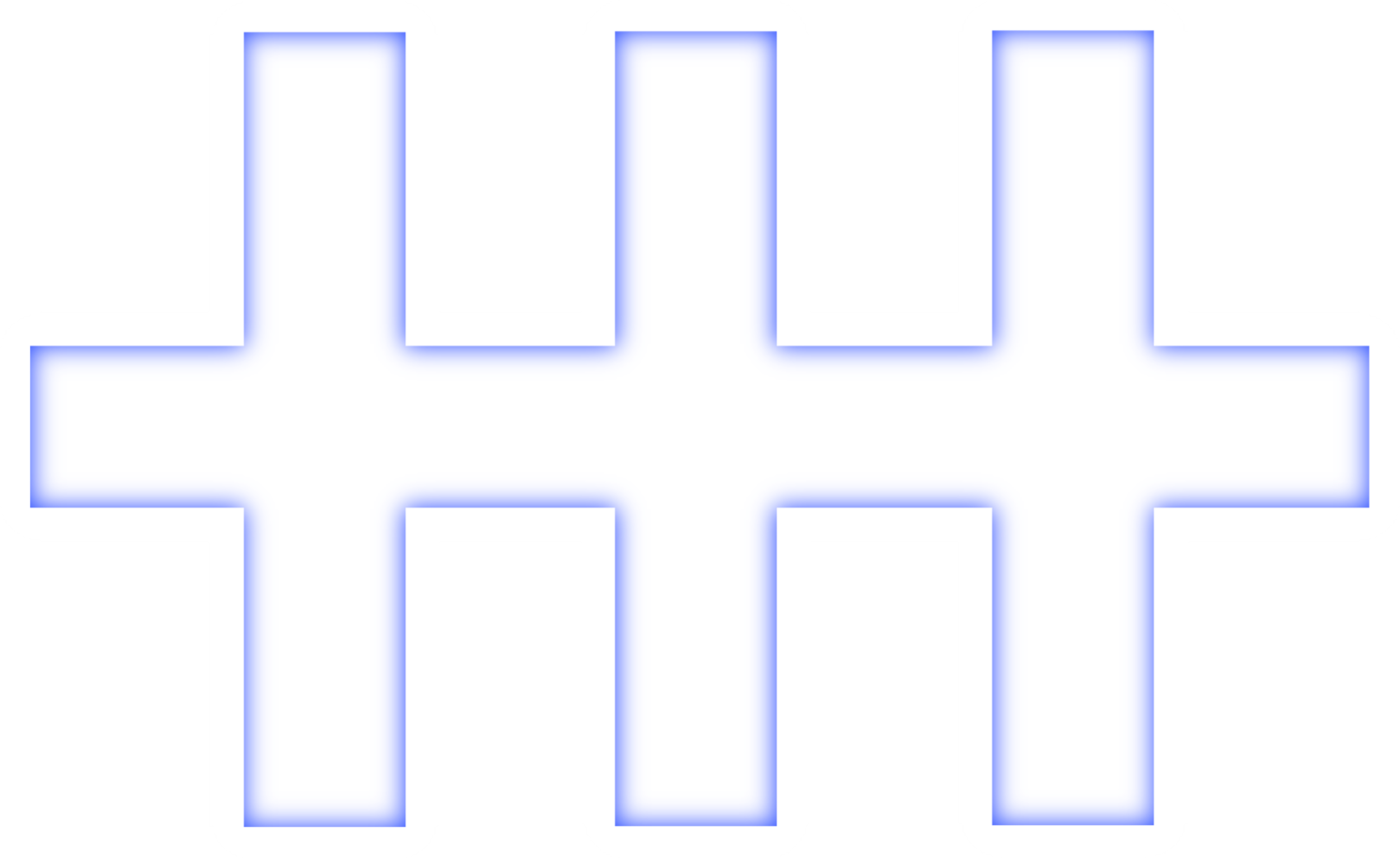
Visual, logo and title typography for a personal mixed media anthology project: MAREDISE.
The typography is 100% custom made and hand-crafted. Through its rigid structure and ephemeral glow, the logo is meant to reflect the more mature tone of the work, as well as showcasing the science fiction setting in which the anthology evolves. The main topics of the work being: unavoidable death - among many other sub thematic. The letters bound together, and mainly the standalone logo M, are also meant to represent the idea of jail cells.
The title appears light and elegant, and serves to accompany illustrations which are constructed with precision and care. Lastly, it utilizes the main colours found across the paintings, while bringing emphasis to the colour RED that is prevalent and important throughout the whole work.


Visual, logo and title typography realised for my personal brand and identity: ZEIZENZEK
The typography is 100% custom made and hand-crafted. It is meant to visually showcase my artist name in an elegant, practical and recognisable way, all while also bringing emphasis to the phonetical repetition when pronouncing the name.
With its compact appearance, it sits comfortably in the top corner of my website for identity purpose.
It also works perfectly for square business card, which are further enhanced by the easy to use and read QR code that sits in the middle of the card, without impacting the legibility.